Record, Report Improving
Project
Providing Personalized Learning Data
‘Reading &’ is an English content reading service designed for children learning English as a second language. We have developed a learning content tab and monthly reports that analyze and improve our products based on the individual learning data of both B2C and B2B users in order to cater to their needs.
Role
Timeline
Oct 2022 - Oct 2022
Deployed in Apr 2023
Team
Overview
Problem
Reading statistics and learning reports are limited to simply recording learning data. Parents are having difficulty understanding their children's learning behavior, and learners are having difficulty understanding their specific learning status and achievements.
Outcome
Improve the record tab to encourage more people to use it, and help learners better understand how they learn.
Increase usage and retention of monthly reports that enable parents to understand and manage their child's learning behavior.
Online Survey
Understanding User Needs through Survey
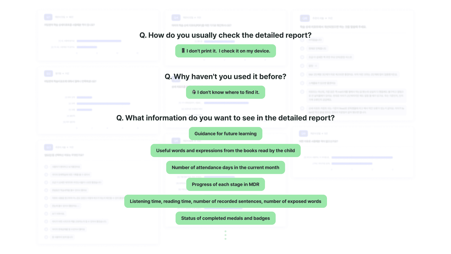
Through a survey of ‘Far-seeing moms’ and an interview with internal CX team member who operate the ‘Far-seeing moms’ program, I was able to discover usage patterns and user needs for the report. (*At READING&, we operate a Mommy blogger program called "Far-seeing Moms," who are highly interested in English education.)
Insights
📅 Today's learning progress instead of monthly
I examined the basic functionalities offered by EPUB viewers, as well as apps that specialize in audio features and English language learning, in order to identify the various features that they offer.
📊 Report usage behavior and accessibility
Parents check reports on tablet and mobile devices, but it is difficult to view PDF reports. There are no notifications for report publication, and some users don't know where to find their reports due to complex entry processes.
📖 Monitoring a child's growth
Parents want to know if their child is using Reading and how much their English skills have improved. However, it is difficult to motivate them to learn more by giving them a sense of achievement.
🗂 Meaningful data
The report only shows learning data for the 3rd stage-reading, and users cannot obtain the desired data in the report because it does not consider children who only learn the 2nd stage-listening.
Painpoint
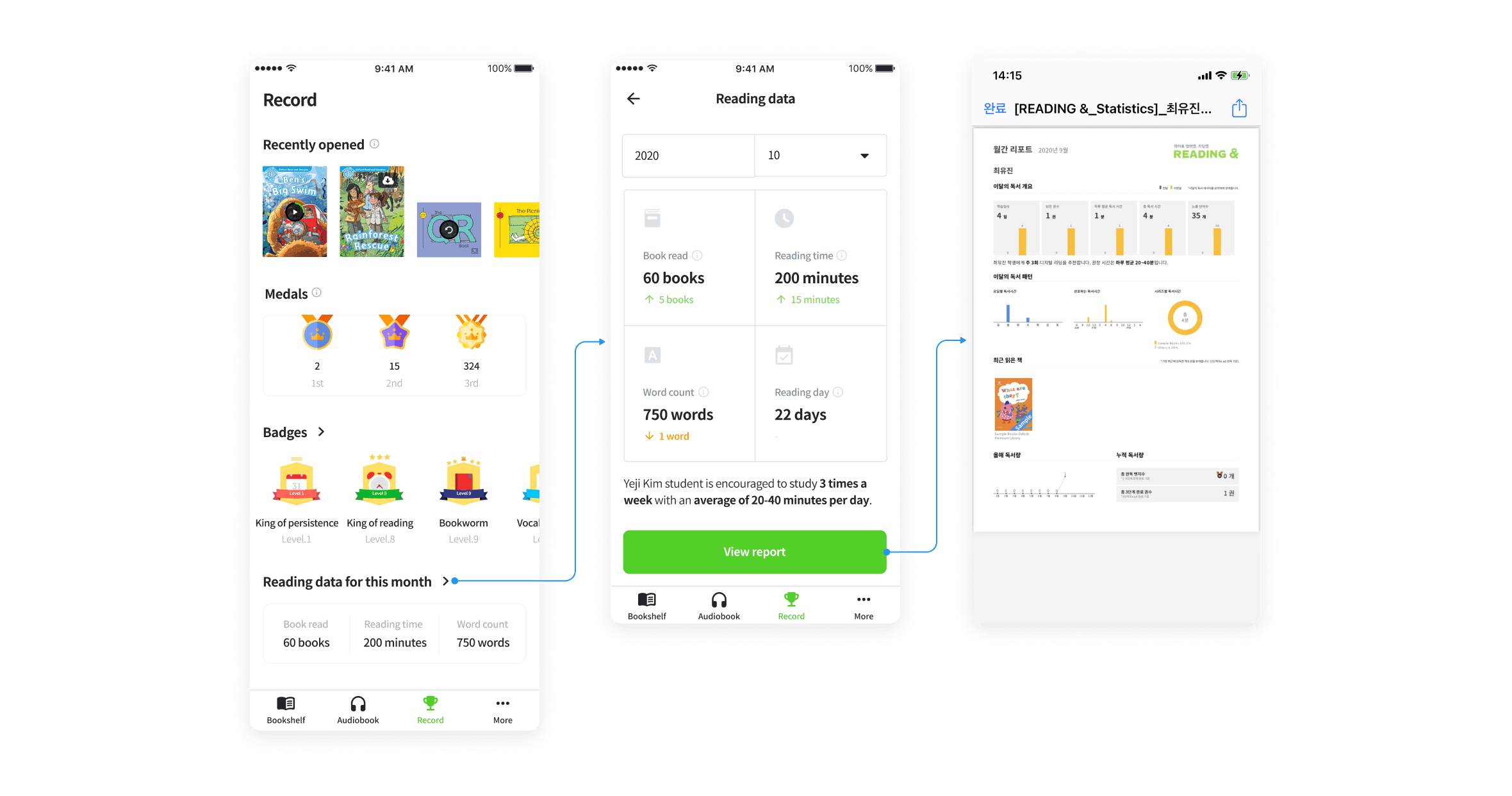
In the Record tab's reading data, users can only see data for a month, making it difficult to receive motivation for learning.
The accessibility of monthly reports is poor, causing users to be unaware of their existence.
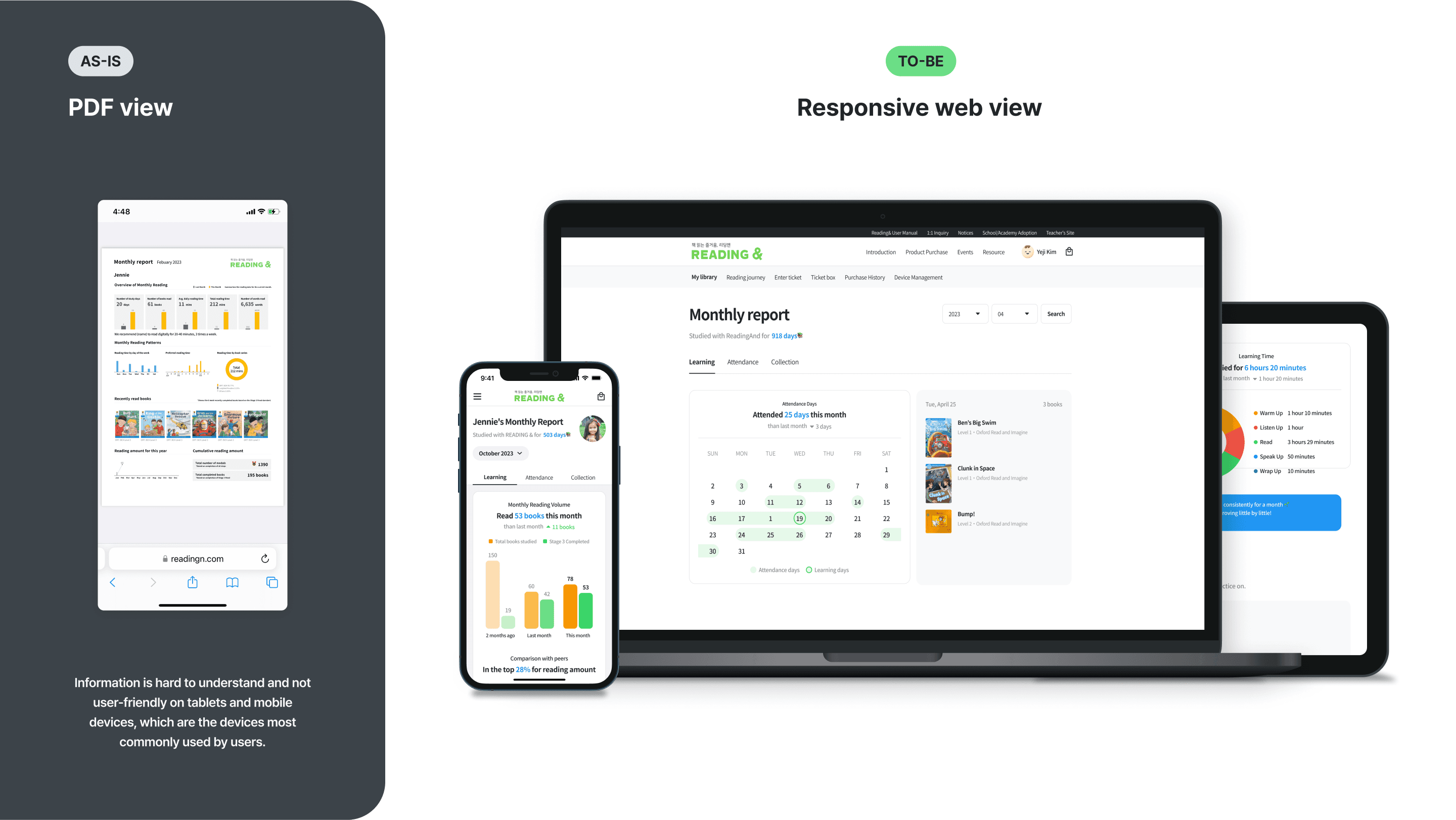
It is difficult to use and read monthly reports on mobile devices and tablets as they are only available in A4 PDF format.
There isn't enough learning information available to meet the needs of both learners and parents, resulting in low usage.
Hypothesis
Providing daily learning progress updates on the books read will help motivate learners.
Sending monthly reports through the app and KakaoTalk on the 1st day of each month will make it more convenient to access the reports.
Providing reports on the web instead of PDF format will improve usability and readability on different devices.
Providing advanced learning data will increase usage rates of the learning history tab, reports, and next month's revisit rate.
Flow Chart
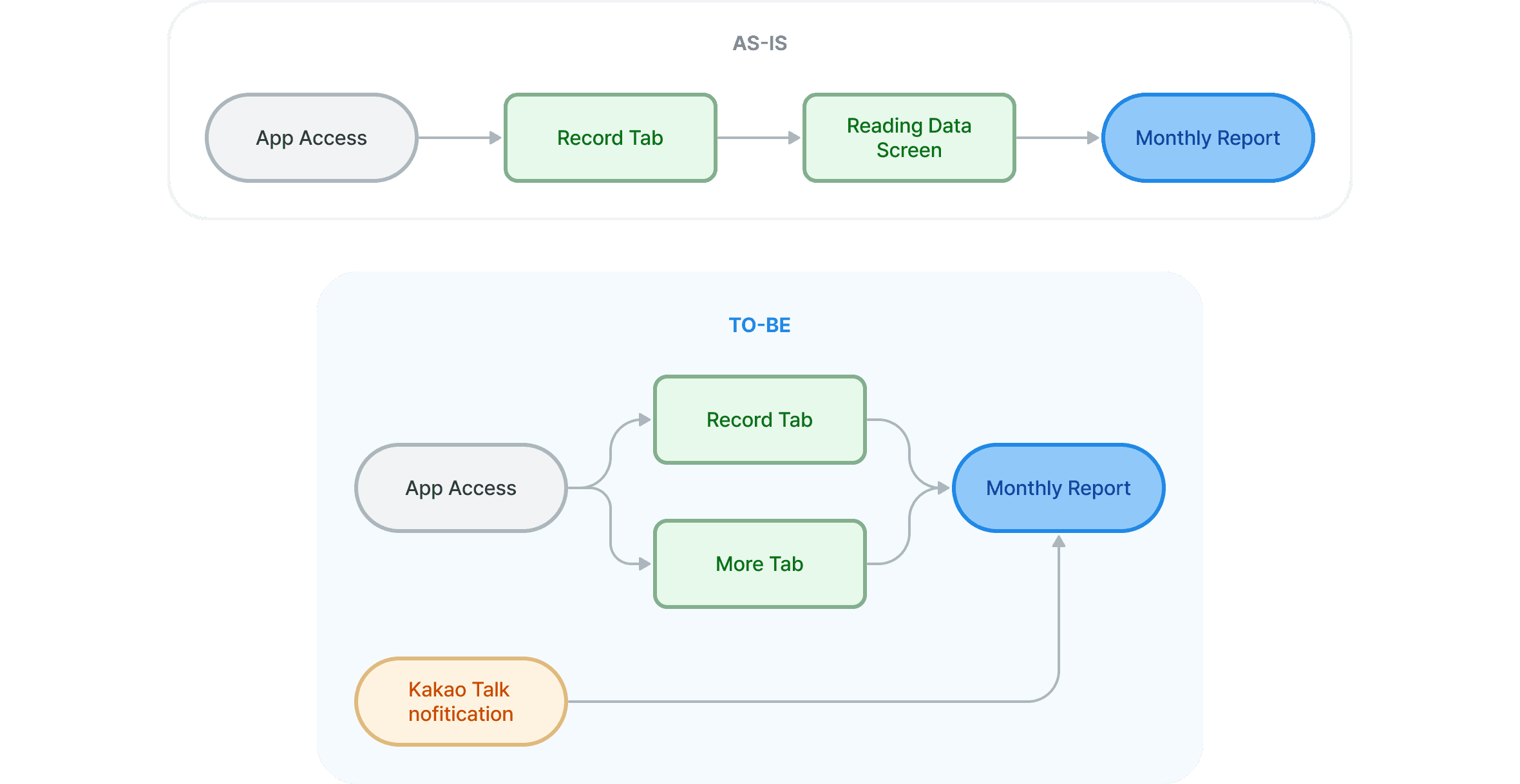
Easy report access flow
Based on the research findings, I have designed a flowchart with a reduced entry depth to make it easier to access the report.
Solution 1
Daily Learning Progress Check
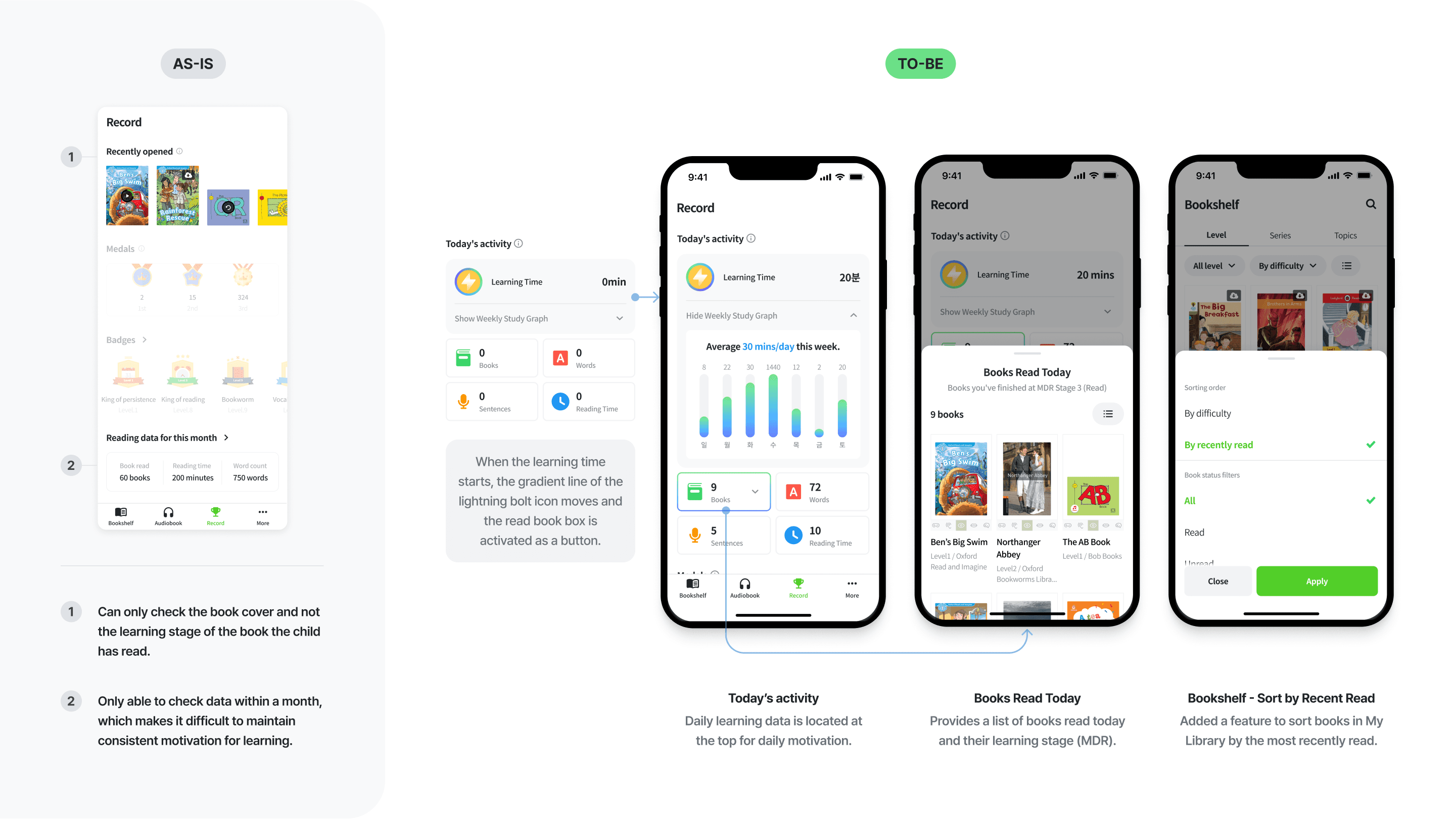
The previous reading statistics only provided data for a month, making it inconvenient to check detailed information by going through an additional depth. However, through improvement, we eliminated the depth and made it easier to check daily learning status and monitoring on the top of the record tab.
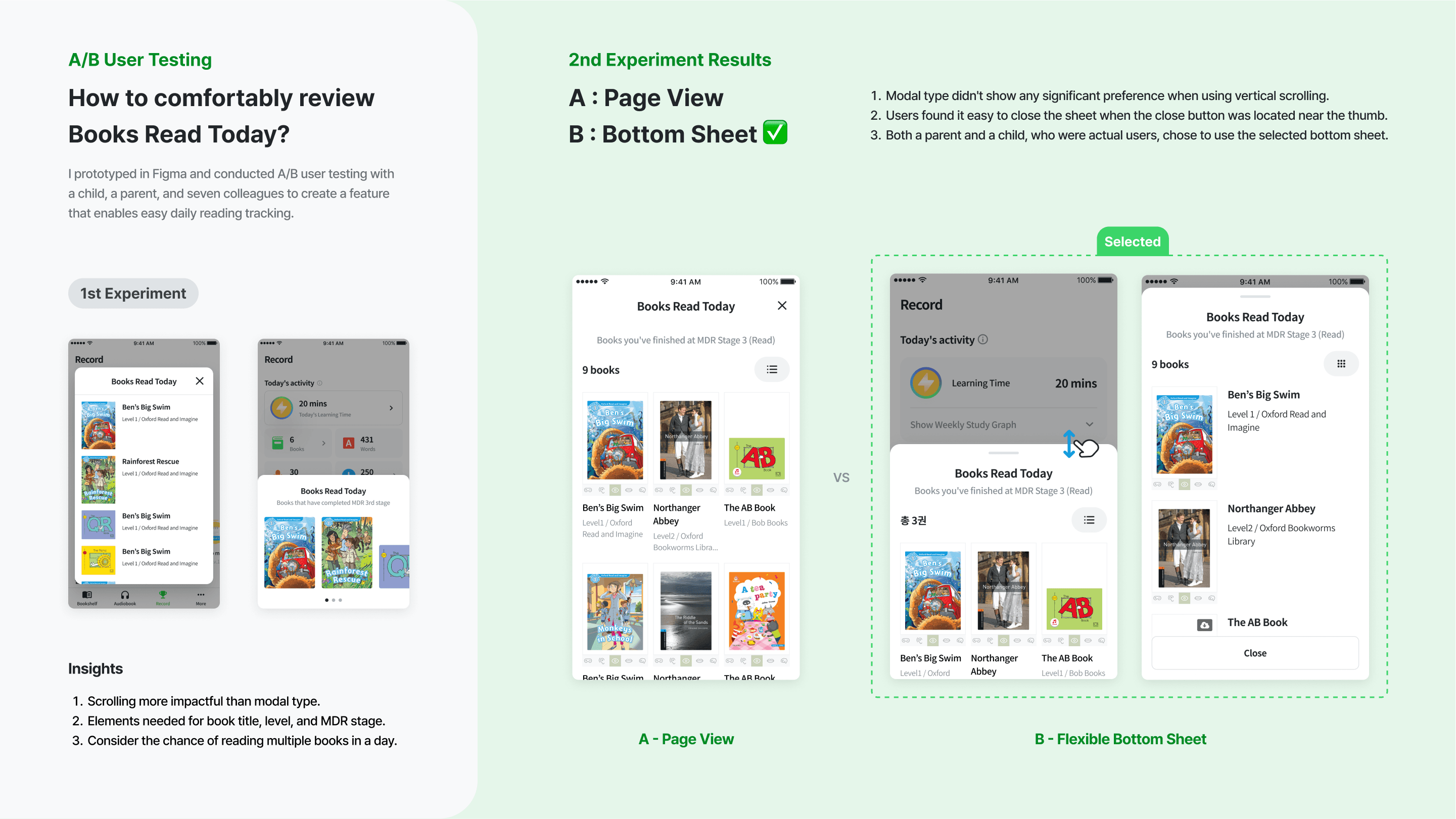
Why today's readings are displayed as a bottom sheet
Based on the user story "I want to see what books I read today" as a goal, we conducted UT with the purpose of ensuring that there is no inconvenience in using the UI that displays it, and designed the final design based on the insights obtained from the UT.
Solution 2
Reducing Depth for Easier Access to Monthly Reports
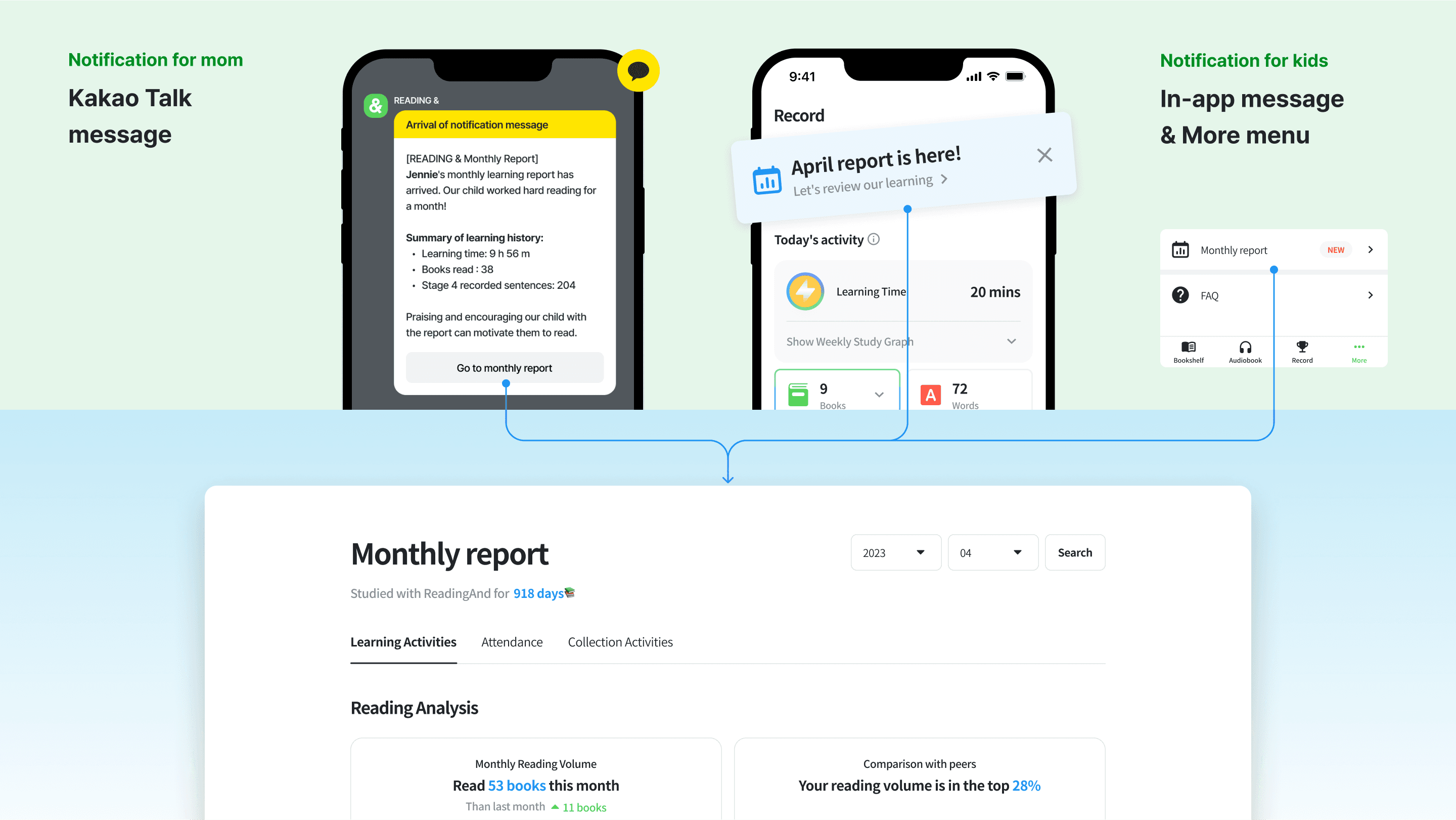
I improved the accessibility of the monthly report by adding a monthly report menu to the app's notification message, KakaoTalk notification message, and "More" tab on the 1st of every month. This is because the previous monthly reports did not come with any notifications and were difficult to access, causing some users to be unaware of their location or existence.
Solution 3
Providing Useful Learning Data
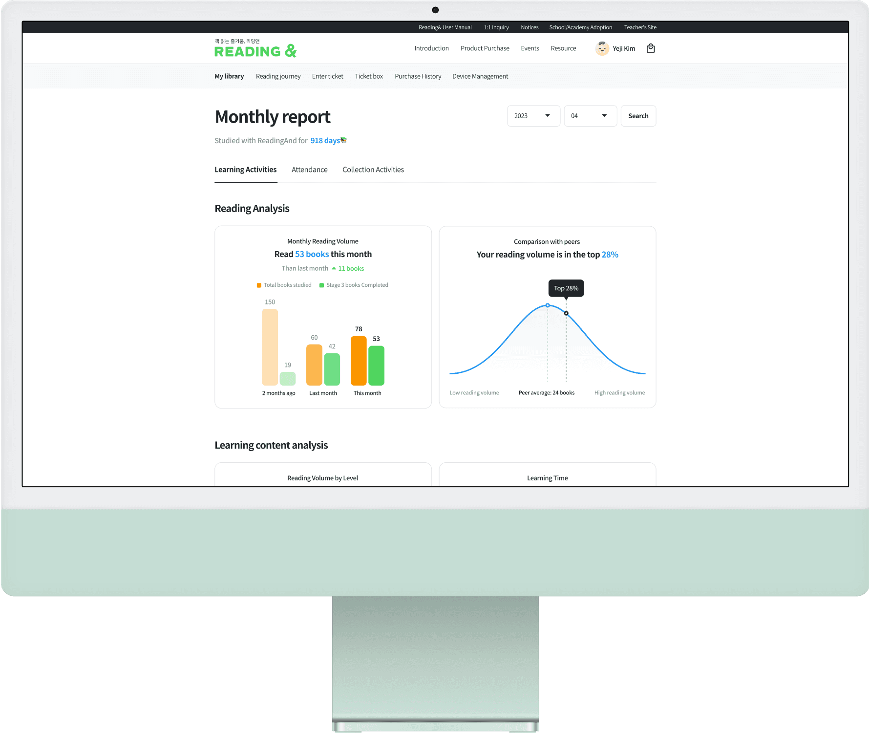
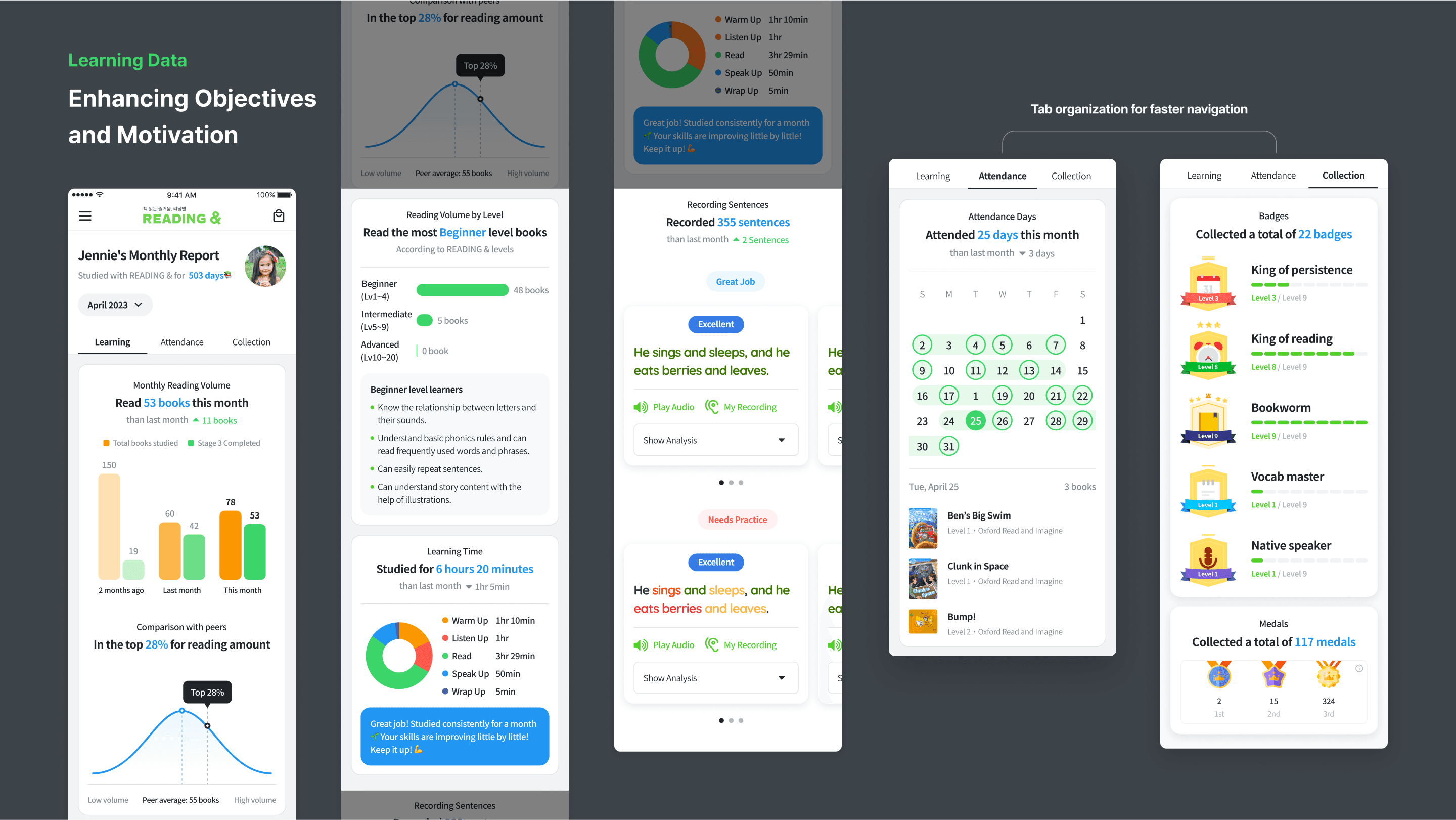
Previously, there was a shortage of useful learning data that students and parents desired. Research shows that parents prioritize monitoring their child's learning progress, comments, attendance, learned expressions, and MDR learning for each stage. As a result, the learning data was organized based on these priorities. This allows users to easily understand how the learner has progressed and feel motivated by their achievements.
Solution 4
Conveniently accessible on any device
Users mainly access monthly reports on tablets and mobile devices. The existing A4 format PDF reports had issues with usability and readability on small devices. We improved usability on various devices by providing a responsive web view.
Takeaways
Data-driven problem solving
By analyzing data collected through reports, I can identify user behavior patterns and usability issues, and design solutions based on hypotheses for improvement. We used GA and Firebase to collect data for validating hypotheses after deployment, learning problem-solving methods using data and achieving successful results.
Development of reusable UI design components for reports
Built responsive report UI components, which allowed us to quickly develop and design chart components not only for the Portal but also for B2B LMS and CRM. This increased the efficiency of development and design, and helped to enhance our understanding of web development environments.
Understanding of both business and user perspectives
Collaborated with stakeholders like PM, marketers, service planner, and developers to plan and design reports for B2C apps, web, and B2B web (LMS, CRM). This helped us consider both seller and user issues, find impactful solutions, and explore new marketing strategies through data analysis. We also performed user testing and used the results to develop better products.
Copyright© 2023. Yeji Kim
